Our typeface is contemporary and balances clarity, elegance and modernity. This typeface was designed with legibility and ʻŌlelo as it's primary focuses.
Family Name
Longs Drugs® Sans takes inspiration from CVS Health® communications, Helvetica, and other humanist-sans.
With a variety of weights and italics, Longs Drugs® Sans is the optimal typeface for brand communications in the region of Hawaiʻi.
Longs Drugs®
Sans
Extra Light
Aa Bb Cc Dd Ee Ff Gg Hh Ii Jj Kk Ll Mm Nn Pp Qq Rr Ss Tt Uu Vv Xx Zz Åå Ē´ Īī ʻ
Light
Aa Bb Cc Dd Ee Ff Gg Hh Ii Jj Kk Ll Mm Nn Pp Qq Rr Ss Tt Uu Vv Xx Zz Åå Ē´ Īī ʻ
Regular
Aa Bb Cc Dd Ee Ff Gg Hh Ii Jj Kk Ll Mm Nn Pp Qq Rr Ss Tt Uu Vv Xx Zz Åå Ē´ Īī ʻ
Medium
Aa Bb Cc Dd Ee Ff Gg Hh Ii Jj Kk Ll Mm Nn Pp Qq Rr Ss Tt Uu Vv Xx Zz Åå Ē´ Īī ʻ
Bold
Aa Bb Cc Dd Ee Ff Gg Hh Ii Jj Kk Ll Mm Nn Pp Qq Rr Ss Tt Uu Vv Xx Zz Åå Ē´ Īī ʻ
Black
Aa Bb Cc Dd Ee Ff Gg Hh Ii Jj Kk Ll Mm Nn Pp Qq Rr Ss Tt Uu Vv Xx Zz Åå Ē´ Īī ʻ
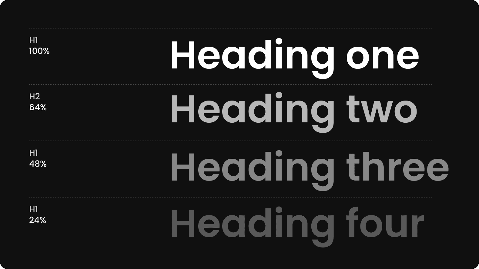
Hierarchy tones
The hierarchy of tones allows for highlighting important information and guiding the reader through the content intuitively. Headings often feature heavier tones to stand out, while the body text may have lighter tones to ensure a smooth reading

